Monday, 4 April 2011
Final Poster

Audience feedback for poster

As with the trailer and magazine cover I posted my poster onto facebook to see what people think of it.
Pretty much all of them said the character names can't be seen well enough which I agree with and will change. Other than that they said it looked like a action adventure film due to the sword and the colour purple which is what I wanted to portray.
The tag line "only the past truly knows us," was the most successful element as all said it would make them want to find out more about the film/watch it and its mysterious and interesting.
Final Poster layout

This poster layout is similar to fantasy posters I researched. It has the main character featured and used colours that have connotations connected to the fantasy/adventure genre. The tag line below the title is interesting, relevant to the film and would hopefully grab an audiences attention. The sword does this also and the colours. The white writing of the tag line and date stands out against the purple, as does the red of the title.
Extras to the poster which I felt were needed are the production company and I included the names of the main actors as is done on many other film posters. This is to use any empty spaces and to create a recognisable feature of the film, the actors in it.
Final Poster Pictures
 For the image above, which I used as my background for the poster I just added the character image onto the background image and also I added a fantasy sword to show the genre and to make it more interesting to an audience. I did this in Photoshop also and turned her wrist slightly so it fit more with the sword. As well as this I made her lips redder to make them more prominent and her stern expression stand out and I tinged the wall she is leaning on a similar purple to the background so it blends with the entire background image, I put a bit of the tree to overlap the wall for this reason also.
 Above is the original picture of the foreground. I wanted it full length so the character filled the page. I used this image because she looks serious but also her stance is very powerful showing some of her character. I got rid of the background so that I could add her to the foreground of the below image.
 The two pictures above of the main background went through the most change. The original picture on the left was taken at Portchester Castle which was appropriate to show an old scene and castles are generally stereotypical to fantasy films.
Sunday, 27 March 2011
Poster start
 These three posters are from fantasy films. I used them and others as research for my own poster. They all feature the main character or a main sub character and contain elements of mystery, most using depth of their images to do this. The 'spiderwick' and 'brother's grimm' posters have rough frame frames in there design which is done using the scenery of the background. I think this makes it look interesting and shows the genre so I will try to use this in the final draft of my poster. The tag lines of these two are also very interesting and make the audience want to know more about the film. Colours are an important part of a poster and with these fantasy ones they use blues, yellows and purples to create mystery and fantasy.


Completed Magazine Cover

This is my completed magazine cover with all the changes in it that had been suggested from my feedback.
I think it works sucessfully as a magazine cover now for the film.
Audience feedback


Magazine Drafts
 These are the drafts of my magazine cover which all look fairly similar but have some minor differences: The cover to the left was the first draft. I added a picture from the movie to it and put exclusive cast interview under it to connect the two. The title of the film is the main writing on the magazine cover and I put it on the hand of the character so that it stood out more. The line beneath it tells the reader what the film is and the font is in a fantasy style in keeping with the film genre. Other features are: What else is inside the magazine, to make people want to read it and at the bottom there is a plus main feature of what you can get from the magazine on the centre page. The writing is white to stand out against the black which is made to look like a film strip. The bottom left cover was changed by positioning the picture in the bottom left corner against the black film strip which now has "Exclusive cast interview..." written on it instead. The writing for what is inside the magazine was changed to fit better on her hand but it does not stand out enough. The bottom right magazine cover is the one I got public feedback from. I kept the picture in the same place and made a badge to highlight the "top 10 films as rated by you," I also changed the colours of the text for what is inside the magazine to how I had it originally as it stood out more and now I had the badge it made enough space on the hand for it to all fit.

Magazine cover main layout
 This is the start of my magazine cover with the main features added created using InDesign.
 - The title: Flic-king is a play on the word flicking which refers to both flicking through pages in the magazine and also, as flims are sometimes refered to as flicks, it shows what the genre of the magazine is (Movie Magazine) and as a king of flicks it implys to the audience that it is a good magazine and maybe even the best magazine for film news.
- The top line: "From the red carpet to your front door" is an extra enforcer to the genre and tells the reader what the magazine may contain.
- The font: The title font is meant to look like a film strip as is fitting with the genre using a font found on dafont.com. The top line is in italics so it looks like its in keeping with the fancy red carpet. The date, price and "Magazine" are all in an easy read font as they do not add to the magazine but are important for it to have.
- Finally, the image: Nothing was done to change the image as I thought it worked fine on its own. Part of the rose was cut off and coppied using Photoshop so it overlapped the title and was hence made part of the magazine. This is done in many other magazines I researched. The image is not a conventional image for a magazine as it does not engage the audience by using a person's face to connect with them using eye contact but I wanted the gun to be the main draw point and the colour red in the clothes to attract attention and interest.
Monday, 31 January 2011
Magazine Cover Start
 These are two of the photographs taken to be used as the main image on the magazine front cover. I chose to use the bottom one because the orientation fit a magazine cover without having to crop out parts of it, also because I liked the diagonal formation of the rose and the gun which would look attractive to a potential buyer and give me much space to put additional magazine information such as cover lines and features.
Final Trailer and Feedback
Monday, 17 January 2011
Public Feedback From Trailer


Class Feedback and Plan
Improved Version
To improve the trailer I changed a few of the editing effects and made the clips shorter so that the trailer is more gripping and interesting to watch and I fitted the music in properly so it matched perfectly to the action. I think I need to make the actor credits shorter again as they are too long and not difficult to read quickly. Also I need to make the voices of the characters at the end louder.
Now I need to add some general credits about the director, producer, etc shown in a previous post.
My Trailer First Draft
The two trailers above are not much different to each other. Their editting are fairly similar but I changed the music in 'Trailer Catts 90 Lives2' to make it match more and be more dramatic in the compilation of scenes in the middle of the trailer. However it still has not worked very well yet and the scenes are too long so make the trailer less interesting to watch.
The feedback I got from it was mainly positive when the viewers were aware that it was only a first draft. I will ask for more feedback on the next version of the trailer so I can have a better idea on what I need to improve on from the viewers.
Monday, 10 January 2011
My Trailer Credits
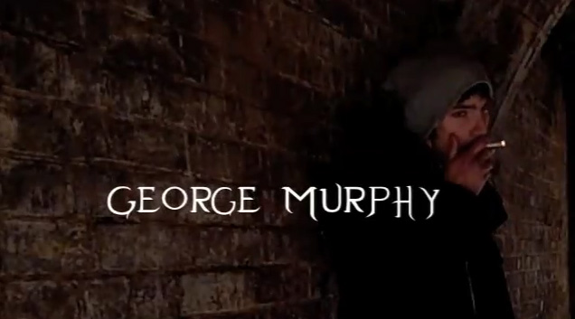
 These are the credits I made for my trailer. I overlapped the Credits for the actors names over images of them unlike in The Golden Compass trailer when they had it on a separate screen. I did this so I could introduce the characters and the actors so the audience can recognise them from the trailer. The font is the same like in The Golden Compass.