Pages

Thursday 25 November 2010

Trailer Credits Research

Above is the Credits for The Last Airbender. The font is very simple and readable but the colours match the feel of the film and the colours used in the title of the film. The information included is the Production company, who the film is by and who it stars. This is to create a recognisable name and sometimes it can tell the audience what to expect from the film, e.g a film by disney would be expected to be for children.

These two Credits are from The Golden Compass trailer. They both match each other in both colour and style even though one of them is an actors name. The same information is given as in the Last Airbender but it also has logos of the production companies and an official website which audiences can visit and see extra features for the film. This creates more interest in the film so they are more likely to watch it. Also it has a small copyright paragraph at the end which states that the characters and places etc in the movie belong to New Line Productions.
The design of the text also matches the film. The font is in gold which obviously matches the film name The Golden Compass. All the font matches the font of the actors name and is easy to read against the plain black background.

Wednesday 17 November 2010

Music to Use

I chose these three tracks to possible use for the trailer because they are all quite fast and tense but also contain smooth and quiet music for building up the anticipation. I used a quiet part of 'Unstoppable' on the last scene of the trailer to try out the sounds.


The track above called 'Kuvera,' the beginning would work perfectly with the voiceover I wish to use at the start of the trailer then it has a more fast paced towards the middle. The disadvantage of using this track is that it uses opera voices in most of it which I do not want because it may distract from the voiceover, also it has little suitable gaps where I can cut it down to the size of the trailer and I would not easily be able to edit out the opera voices.


This track is called 'Vishnu' and contains no major operatic voice. However it doesn’t start off as smooth as I need it to in order to create a build up of excitement.
This track does have the feel of a fantasy film to it by the high use of stringed instruments and the subtle use of the choir nearer the end which could be edited out. The pause near the end could be useful in adding a dramatic scene there but this effect could be created using any of the tracks that have suitable cut off points.
Another disadvantage to using it is that the end doesn’t stop how I would like when Lorcán and Cattell speak as I want a soft background noise to it.


This track, 'Unstoppable,' seems the most usable for the trailer, the beginning is slow and intense, there is a short dramatic pause and then it continues right into the fast and heavy action part of the track which I can cut away easily to make it short enough for the trailer and add it into the correct parts. The part when the track reaches its climax would be perfectly matched for a scene montage where I will introduce the credits for the actors’ names. As mentioned before I have used the very end of this track when it fades to quiet for the speaking scene at the end which is subtle but works very well.


Unstoppable was also used as the track in the Sherlock Holmes trailer so I know it works well as a fast paced and also slow track for the intense scenes and action scenes and fits very well in the montage and credits.

Tuesday 16 November 2010

Credit Font


Now I started looking for a font for my star's names using Eleanor Sim as an example. This font is too simple and doesn't match the title font. It is however very easy to read but looks too Arabian style to use with the theme of the trailer.

With the font on the left, 'Kingjola', it works well with the title font as it has simialr curls but the font doesn't have capitals so the name does not stand out. It is the most fitting to the title font though.


This last font called 'Evanescent' is similar to what I wanted as it is easy to read and stands out, it also fits as a fantasy font but does not match the title very well unlike the one above.

I will choose between the 'Evanescent' and 'Kingjola' fonts by putting them into a first draft of how I want them to look on the trailer.

Text Font

I need a font for the title of the trailer and a font to use for the credits too. For this I used dafont and looked in the sub category 'Gothic' and 'fancy' to find an appropriate font.


The font above is called 'A Charming Font' and looks like something similar to what I want but it would match the trailer and genre better if it was a little more decorated and stood out.


This font above is more fancy than the one before and does reflect the fantasy style but the sharp edges and moon shapes may give people the impression that it is going to be a vampire or werewolf movie.
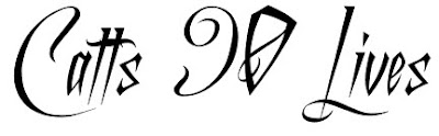
This last font is called 'Dutch and Harley' and is perfect for the trailer title. The font unfortunately doesn't contain numbers so I added the '90' in on photoshop but I like the spiky contrast from the smooth and fancy curls, it matches the contrast in the trailer between the fantasy side and the modern hardness to Cattell's character and what she has had to live through.

Music Research

For my trailer I am most likely going to use a track from E.S Posthumus. They are an independent music group whose music is a form of classical with drum rhythms and electronic sounds accompanying it to create a cinematic style. Their music has been featured in films, television shows and trailers such as Sherlock Holmes, Vanity Fair and Unfaithful.

Their music has also been used on Top Gear, Celebrity Masterchef, the AFC Championship and the re-release of Avatar.

I think the music would be suitable for the trailer because the escalating structure in most of its songs is perfectly suited to the traditional montages that are featured just before or during the credits of a trailer.

Monday 1 November 2010

Scene Filmed

This is the scene from the storyboard filmed. Some of the shots were changed as they looked better when I filmed and edited it together.

There are a few problems with it which I will change and then see which version works better:

One of the main problems, is with the colour of the shots. This is because the ones with only the female character in them, had to be filmed at a different time from the ones with both characters in. This caused the ones filmed later in the day to be too dark, compared to the rest. When editing, I tried to compensate for this by adjusting the brightness of all clips. However it didn't work very well so I am going to re-film the dark, grainy shots and make sure the light is better. This would also mean I can use the original brightness of the clips I made darker, which will restore the colours.

Before I decided to re-film these shots I first asked people what they thought of the scene with specific reference to colours and lighting. I got a mixed opinion from this question, some people said that it looked fine how it is because the effect on the colours added to the feel of the scene and genre. Whereas, others said that the scene itself is good but because the clips are all different in colour and lighting, it doesn't work well together but if the colours were all similar it would look better.

Due to the 50/50 response, I have decided to re-film the scene and use the same colour effect by changing the contrast of the clips. This with the re-filming in lighter conditions would mean that all the clips match.